Bad photo editing can ruin an otherwise great photograph. But it doesn’t have to be that way. By avoiding these ten common mistakes, you can make your photos look their best.
1. Bad Photo Editing: Your Model’s Skin Looks Like Plastic
I live in Los Angeles, right near West Hollywood. I am no stranger to the Hollywood style of photo editing.
It’s one thing to bring out someone’s best look. It’s quite another to make them an unrecognisable plastic doll.
Your client will likely not want to look Photoshopped either.
No one wants their friends and families to comment on how Photoshopped they look.
The key to fixing this mistake is to edit the original and retouch side-by-side. That way, you can check if you’re going overboard with your skin smoothing!
You should also consistently duplicate skin texture when you are cloning. This way you won’t have areas that are far too smooth and textureless.
If your subject is wearing blush or has contouring makeup, I suggest using the Healing Brush Tool. This will help you keep the original colors true to where they were.
2. The Eyes Are Too Bright
Many photographers want the eyes of their subjects to stand out. They will use the dodge tool to brighten the iris of the eye. This will cause it to ‘glimmer’, so to speak.
However, there is a threshold you shouldn’t cross when doing this as it makes the eyes look freaky. Unless you’re going for an otherworldly fairy look, pay attention to how much of the iris you’re lightening.
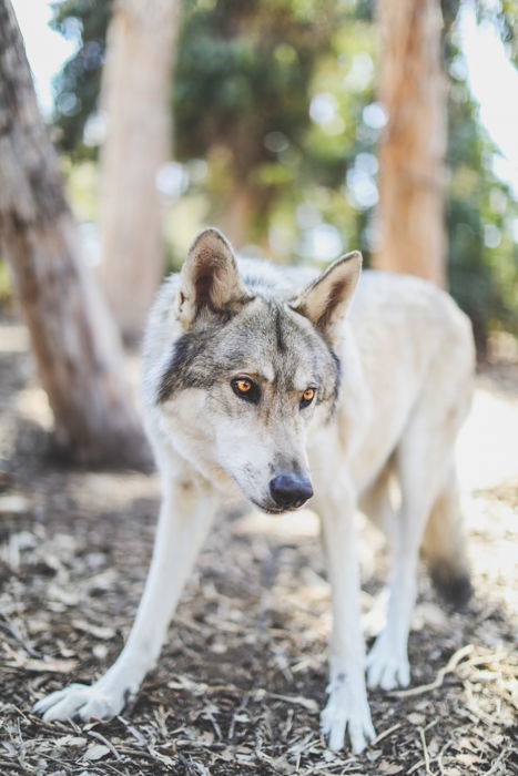
This goes for both humans and animal subjects, as this effect is often applied to both.
A good trick to making eyes pop is to go over the iris with the dodge tool one time at approximately 50% opacity.
You can use white balance to make sure that the white highlights of the eye are a nice, crisp white.
Then select the burn tool at about 50% opacity. Now burn the edges of the iris to give the dodged area a bit more contrast.
This prevents the eyes from appearing over-edited. But they’ll still stand out nicely.

Or the Teeth Are Too White
A very similar issue plagues teeth. In those bright, happy smiling shots, photographers will often whiten the teeth.
This is because photography white balance can cause teeth to look more yellow in the frame (even if they aren’t!).
However, making teeth too white looks unnatural. It’s also an eyesore as the viewer’s eye will be drawn to the lightest part of the frame first. You don’t want teeth to be the lightest part of the frame!
My suggestion for teeth is to whiten them on a separate layer. And then lower that layer’s opacity down.
Play with the opacity level until you find a nice even ground – not too white, not too bright.
3. Your Image Is too Flat or the Contrast Is too High
Contrast adds definition to an image. But with increasing contrast, you are often darkening the darks significantly. Or whitening the whites drastically.
This causes a loss of detail in your image, and once that detail is gone you can never bring it back.
On the reverse end of the spectrum, a lack of contrast can create a flat or drab image.
Matte images are all the rage right now in photography. But too much of a mattifying effect can cause just as much unrecoverable detail loss.
The key here is to understand how to use curves to add contrast (or take down contrast) in your image. Avoid the sliders. Add or remove contrast using a detail-oriented method rather than a general change.
Remember to make your adjustments on an adjustment layer, not your original layer.
4. Color Tonality Is Off
Some colors don’t match with one another because their tones are far too different.
This most often happens if you are attempting to split tone your photograph. This means editing the color of the shadows and the color of the highlights separately.
Make sure that your colors match one another by ensuring they are the same tone. Some of this is using your own eye. Some of it is ensuring your monitor is calibrated properly.
And some of it is watching the mountains and valleys of a color frequency chart.
This being said, don’t try to fix the problem with the selective coloring approach.
Selective coloring means turning an image black and white with only select colors remaining. This is an editing trick of the past. And it has unfortunately not aged well in modern times.
A good tip is to load your photograph onto different kinds of screens. Try your laptop, desktop, cell phone, or tablet (or all of them), and see how it looks.
Another area to look at is the light sources. If the scene is using two or more different temperatures, it will give your white balance a run for its money. It is very difficult to correctly balance natural daylight with fluorescent for example.
Here, you may need to edit parts of the image separately focusing on the temperature. Or failing that, this is a perfect opportunity to convert your images to black and white.
5. Over-Cropping or Using the Wrong Aspect Ratio
General compositional rules include leaving enough negative space in an image.
If the subject is too closed off compositionally, the image will feel claustrophobic.
Keeping this in mind, a very prevalent editing mistake is over-cropping a photograph.
To avoid this, try cropping according to the rule of thirds, golden ratio, and other compositional rules.
A secondary issue of cropping is the ratio. This is an area that plagues print photographers.
In order to print images, your image must be the proper size. Cropping to an improper size leads to issues when it’s time to hit the printing press or photo printer.
Check out our article here for more on choosing the right ratio for your image.
6. Too Much HDR
HDR stands for high dynamic range. This is a type of imaging in which the shadows and highlights have a lot of dynamic range.
If your subject exceeds the camera’s dynamic range, the highlights tend to wash out and be too white. And the darks also might become too dark and lose detail.
With HDR, you bring the shadows and highlights full of detail into the range that you want them at.
HDR is a computerized process and is impossible to achieve naturally. There tends to be a bit of a gray area on how much HDR is too much.
A big editing mishap is using HDR in the extreme. Much like the other qualms listed in this article, too much of anything is a bad thing – moderation is key.
This is especially true when working with a computer process like HDR. If your image looks like a 3D rendering or a video game rather than a photograph, you’ve gone too far!
7. Editing on the Original File
Also known as ‘destructive editing’.
Here are several reasons why you should avoid this:
- You eliminate the source material. If you make a mistake or want to go too many steps back, you are out of luck.
- You won’t have an original image to reference. This means you can’t check if you’re over-editing or moving too far from the original.
- You can also reduce the image quality by saving over a JPG file too many times. Each time you save over a JPG file, a bit of destruction occurs.
There’s an easy way to fix this. Simply create duplicate layers of the source material whenever you edit. That’s it!
8. Over-Sharpening
The focus the camera captures and the amount of contrast on your subject affect your image’s sharpness.
For an image to be considered sharp, it needs to have contrast. If there is little contrast in the image, the subject will not look 3D. Regardless of whether the focus is perfect or not.
Our vision naturally detects edges to register sharpness. And it uses shadows and highlights to record the depth of a subject.
Additional sharpening post processing can force the edges to be more prominent. I do this as well.
However, too much sharpening can result in halos, artifacts, and a lot of unwanted noise. All of which are not good additions to your photograph!
Don’t even bother trying to fix focus with sharpening. Unless you have hours to kill and are extremely skilled at selective sharpening, it won’t work.
I suggest sharpening via a high pass filter. Don’t use any pre-programmed method of sharpening. The high pass filter allows you the utmost control over the edges of your image and the intensity of your sharpening.
Here are the steps for high pass filter sharpening in Photoshop:
- Duplicate the current layer
- Filter < Other < High Pass
- A menu will pop up in which you define your edge. I tend to keep the number point between 10.0 and 11.0.
- After you click ‘Ok’, then go to the dropdown menu in your layers window and select ‘Hard Light’.
- Now adjust the opacity! If you only want certain parts of the image sharpened, use the eraser tool. Delete the parts of the photograph you want soft.
Keep in mind that when uploading photographs online, websites have a tendency to compress and resize images smaller. This is especially true for social media (Facebook, Instagram, Twitter, etc.).
When images are sized and compressed, they become sharper. If you sharpen your image too much and then upload to the internet, you may see that your image becomes too sharp.
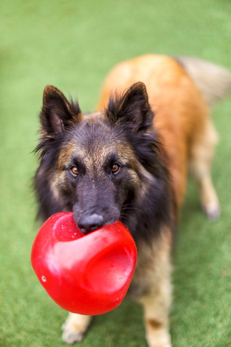
9. Patterning When Cloning
Photoshop’s clone stamp tool allows you to duplicate part of an image. You set a sampling point in the image which you use as a reference to create a new cloned area.
Many, such as myself, use this tool in order to remove something from a photograph.
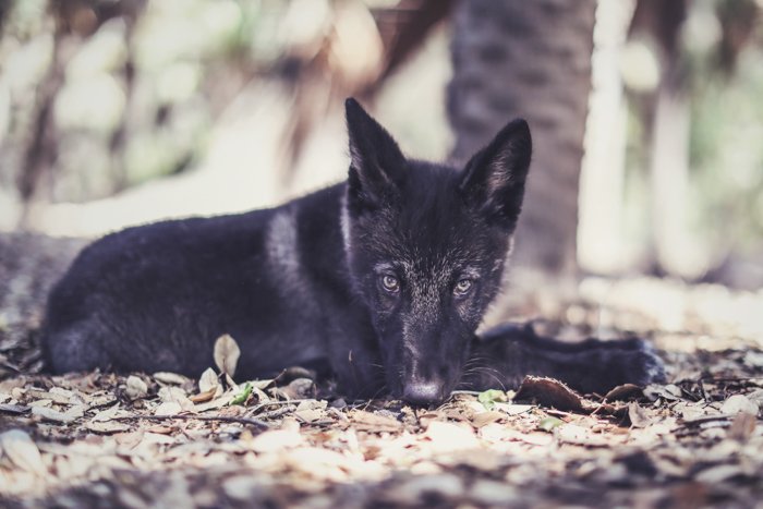
I recently did a photo shoot with a dog and there was a distracting bright neon blue ball in the grass. So I used the clone stamp tool to clone the ball out of the photograph.
To do this, I copied an empty section of grass and drew that over the ball.
The problem many run into with the clone stamp is that sometimes, patterning happens. This means using the same pattern too many times. Wherever you tried to clone something out becomes apparent.
The key here is to consistently sample a new area. Don’t get stuck sampling one small section. Re-sample new spots in order to not duplicate the same texture too many times.
This prevents patterning and makes your image look far more believable.
10. Not Calibrating Your Monitor
Some may think that monitor calibration is only important for print photographers. That’s not true. Making sure the colors you’re seeing are the real ones is important for any photo editor.
You don’t need a high definition computer monitor for this. It can help, sure. But most new laptops already have high definition screens by default.
For desktop users, you can purchase a high definition screen and add it on to your current build.
In either case, you should make sure that whatever screen you are using is calibrated properly.
Editing your colors on a calibrated monitor means they will appear in the right range to anyone who looks at your photograph.
This also eliminates the headache of accurate colors if or when you decide to print a photograph.
Conclusion
Editing software has become as much a necessity as the camera and lens itself.
But it is very easy to lose sight of the simplicity in producing a visually stunning image in camera. This leads to over-editing, where an image is far too overworked for its own good.
It’s a good idea to set your work aside for a few hours and then peer back at the creation. You can then, with fresh eyes, decide whether you’ve done too much editing and if toning things down is a good idea!
Looking for more editing tips? Check out our new post on how to fix bad photos next!